Table of Contents
Vorstik V1 - Portable MP3 Player
![]()
![]()
![]()
![]()
![]()
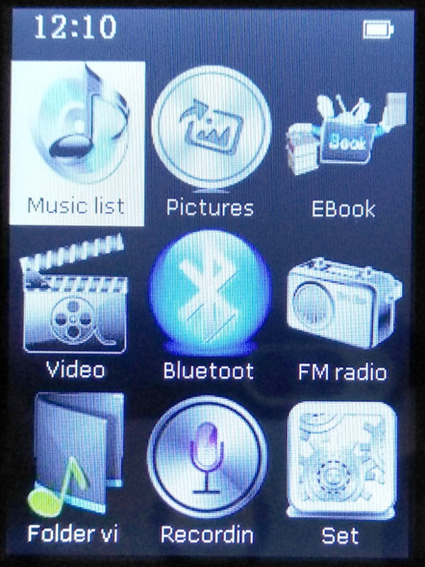 A brief review of a this MP3 player, focused on the handling of full music albums. It is actually a Chinese no-brand MP3 player, shipped by some on-line reseller with varying fantasy brands, as Vorstik or Verstik; it seems - from some photos seen on the net - that the firmware is the same as the one running in the Benjie K11 and BJ-A12 models. The main features are a metal body with glass screen, Bluetooth connection and FM radio, a 2.4 inches display TFT color (non-touch), integrated mini-speaker.
| Display | 2.4 inches, 240×320 (?) pixels, TFT color. |
|---|---|
| Memory | 8 Gb, expandable to 128 Gb with microSD. |
| Buttons | 7 front touch buttons + 3 side phisical buttons. |
| Battery | Sealed rechargeable battery. |
| Connector | Micro USB for charging and file transfer. |
| Extra | Bluetooth connection, FM Radio, speaker. |
From the home screen: Set ⇒ Information ⇒ Player information we read Model Vorstik V1, Version V.01.1.1.1.
Pro
- Low price.
- 8 Gb storage space, accomodates about 80 music albums in 256 kbit quality.
- Quick and responsive user interface.
- Support for extended charsets (accented characters, etc.).
- Support MP3 and Ogg/Vorbis codecs.
- Scan tracks for ID3 tags, browse by album, by artist, etc.
Con
- Poor quality display.
- Truncated directory and file names, track titles, album names, etc.
- Inline picure not supported in Tag 2 Vorbis.
- Per-folder (album) artwork poorly supported.
- File browse mode not alphabetically sorted.
- Non-oleophobic display glass: full of fingerprints in few minutes.
- Internal clock loses its time randomly.
Browsing Music
When you connect the music player to a PC using the provided USB cable, it is detected as an USB mass storage device, so you can copy music tracks to the internal memory. I used an organization by album, i.e. all the tracks composing an album are stored into a single directory.
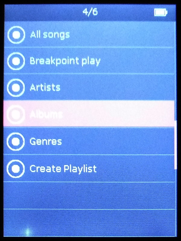
When you eject the device from the PC operating system, the player updates its the music library scanning for ID3 tags. I used V2.4 tags, which are recognized correctly. If the music collection is correctly tagged with ID3 tags, the player can browse the music collection by artist or by album, in alphabetical order. This is very handy.
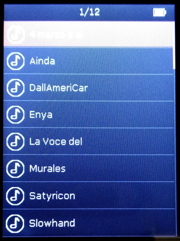
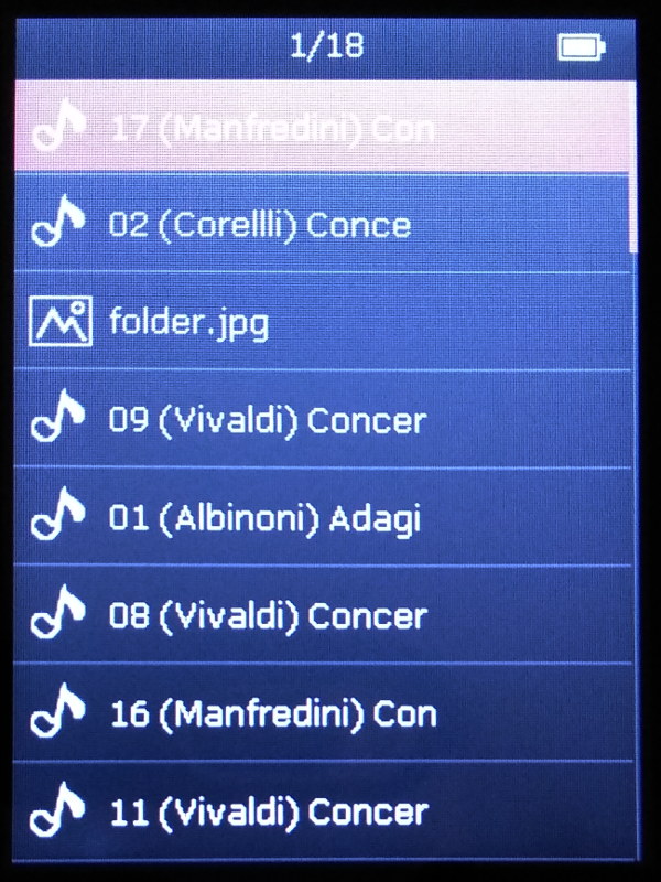
In the above pictures you can see how - in the Album view - the names are truncated to 12 characters. Browsing the file directories (in my case each folder is one album) the file names are truncated to 19 characters and they are not sorted.
Truncated ID3 Tags
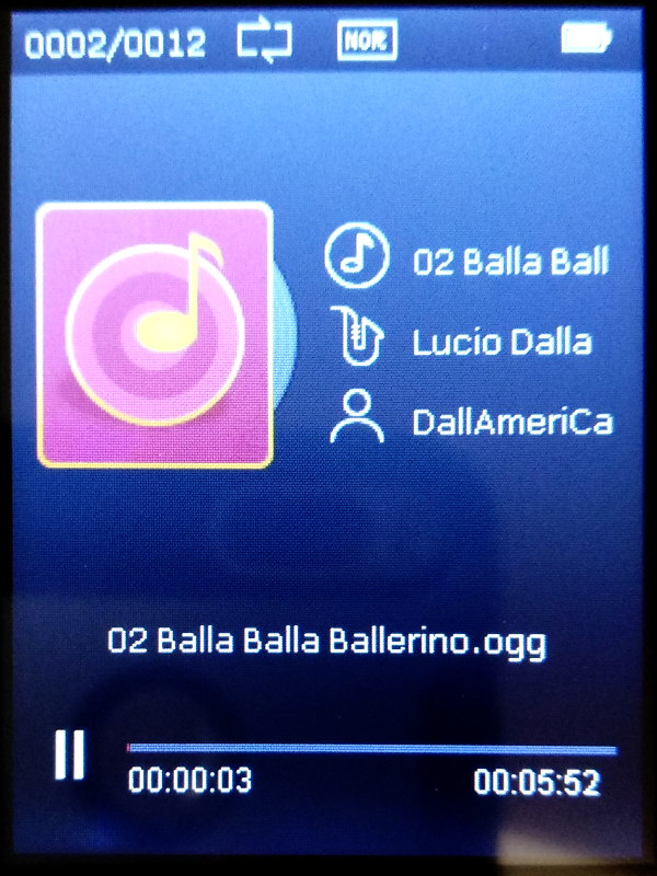 One of the worst defects for usability of this player, is the user interface truncating ID3 tags: album name, track title, artist name, everything is truncated in player screen. This is very unpleasant, considering the fact that the display would be wide enough to show much more.
Per-folder (Album) Artwork
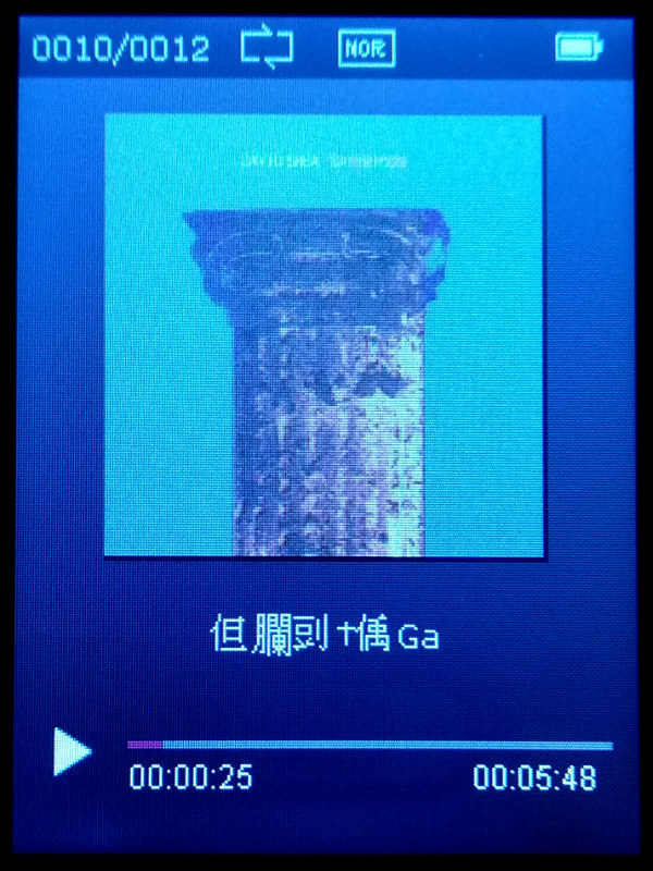
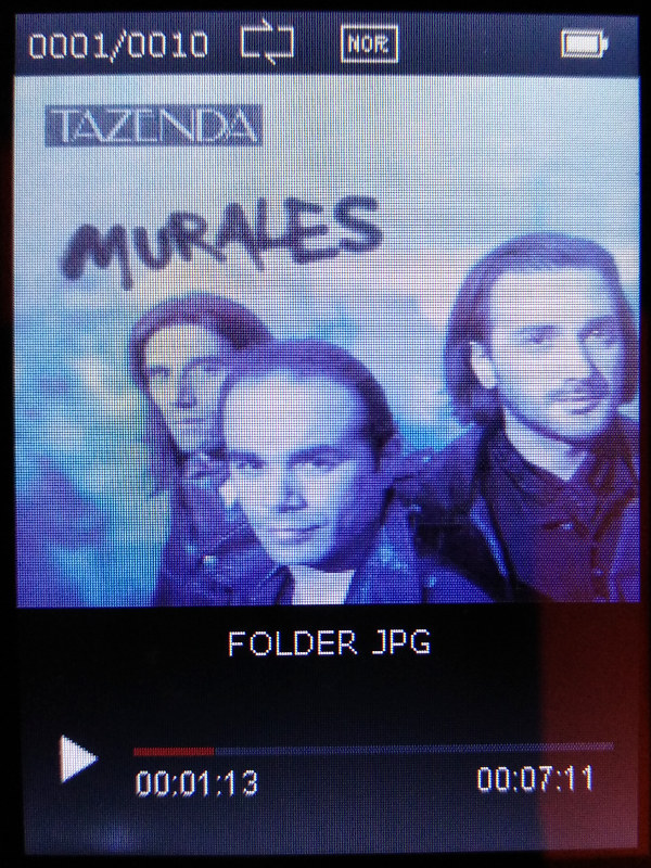
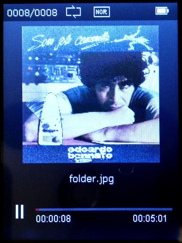 I tested the player uploading an archive of tracks organized into directories, i.e. every directory contains all the tracks from a single album and every track is named as "%n %t" (track number, title). It turned out that if a picture named folder.jpg exists into the directory (a convention used by the Kodi multimedia player), that picture is shown during tracks playback. Unfortunately that picture will hide the ID3 tags, even the filename of the playing track is replaced by the picture filename: a very silly behaviour! Other times I got chineese characters instead of the image name, mixed with part of track name; so definitely there are bugs in the management of file names, where the Vfat filesystem is a source of countless problems.
It is also unclear why the image is sometimes resized correctly to occupy the entire available space, other times it remains much smaller.
Sound Recording
An handy feature is to use the player as a sound recorder. It is not clear where is the inside microphone: there is not an hole in the body marked as mic. From my tests it seems that the mic is on the bottom side of the player, may be it uses one of the holes on that side (micro USB, SD card slot or phone jack). The microphone is quite sensible, it is better to leave the device on a flat surface because if you hold it with an hand, you will record the noise of your fingers grabbing the device.
